Wednesday, November 26, 2008

VERY sucessful campaign by Mac


There aren't too many ad campaigns out there that can match the quality and positive reception that Mac commercials have had for the past 5 or so years. They have made owning a Mac cool, and branded PC's as faulty and lame. When Vista started having problems, they immediately jumped all over it. Microsoft attempted to counter their ads, but they just came off as 'me too!' and failed miserably. The iPod commercials/campaign have also been incredibly popular. So much so that the actual product (mp3 player) is known better as an iPod.

The style of both is very simple. Both feature white (Mac) or neon coloured (iPod) solid backgrounds with solid dark figures in the foreground. Although this technique has been done to death before and since, it is for good reason.

If only Mac laptops didn't cost twice the amount of a similarly featured HP notebook.

AIDS (tagline) "Makes us all equal"


This ad definitely speaks to me, and I think is a great example of seeing O'Gorman's class concepts in the real world. Recognizing how the Kickstart techniques are used in "real life" has been a great experience.

I just came across this ad and think its amazing. We have a play on words, metaphor, storytelling, as well as graphic content that really hits home. Essentially, anyone and everyone is affected by AIDS, even badass superheroes like Wonder Woman.

Tuesday, November 25, 2008

A Commercial by the REAL Bernardi


This is a commercial that I made for ENGL/DAC 202 a couple years ago. The class was about the same size as this one, in groups of 3 we made three videos over the term. This was the second one; we were asked to make a 30 second clip for the UW store, without using sound and incorporating the BookStore logo in some way. It was a competition between all groups, and ours won (the prize? It was streamed on TVs around campus and a $20 gift card at the UW Store!!)

Because we couldn't use sound, we wanted something very visually stimulating so we decided on making a stop-motion technique. That 10 seconds of me getting dressed took almost 2 hours of standing still, and almost 2500 photos. It really gave me appreciation for movies like Team America and other examples of the kind. This was my favourite course of taken at UW, and I wish I had the oppurtunity to take more.

Monday, November 24, 2008

A Commercial by (another) Bernardi

This was a commercial my older brother (currently in advertising as art director at agency in Montreal) made while in graduate school in Atlanta.

It was made by him and a friend. I couldn't find a direct link to the video, but if you click 'Create your day' and then 'View full day' his commercial will play. I thought the commercial was awesome, but obviously I'm pretty unbiased. I think it does a good job at using white space as everything on screen (background, shirt) are white, and objects are always bold coloured and so the actions shown stand out more.

while we're plugging people/things (eh Stephanie),, his website is http://www.andrewbernardi.com/

FLATPAK

What does this post have to do with our class or blog....nothing I can immediately think of....maybe the growing popularity of the environmentalist movement advertisers have thrust open western society, making things like FLATPAK a fad? Possibly, with the economic downturn, FLATPAK is the simplistic way of the future?! I don't know, I don't care....I think FLATPAK is fucking cool.

Check out their website. http://www.flatpakhouse.com/ If you are into interactive graphic design/website design, this baby is snazzy. If you like what you see, click http://www.flickr.com/photos/flatpakhouse/ for more.

PS - Did I just say snazzy?

Speaking of Commercials...

Have any of you seen this commercial?! http://www.youtube.com/watch?v=I6tlzQyjyao

I love it! It's been stuck in my head all week. I find myself singing "Boomdiadah" "Boomdiadah" "Boomdiadah" in the shower, doing my homework, cooking dinner, brushing my teeth....Would this classify as an ad that gets you thinking after the fact...not necessarily cropping out/zooming in on an object and asking the reader to connect the dots...but something that leaves you wanting more...a catchy jingle or that crap-tastic zune ad...I wished we looked at more Barq's type ads in class. There's a lot to be said in terms of "creative" advertising for commercials....boomdiadah, boomdiadah, boomdiadah....

Sunday, November 23, 2008

ZUNE AD - Another Microsoft Failure

What are they thinking down at Microsoft. COMPLETELY retarded. I don't know why they keep trying to be something they are not.....Microsoft is not COOL. I find this ad completely disgusting...I can't figure out what category it fits into...metaphor for "releasing your creativity." Ew...I'm cringing thinking about the "release."

I HATE THIS AD. PROCEED WITH CAUTION.
http://adsoftheworld.com/blog/ivan/2008/nov/20/zune_wtf

Friday, November 21, 2008

Barq's: Now that bites!


I gotta say, these commercials and Barq's ad campaign in general were extremely sucessful in the mid to late 90's. I remember kids everywhere drinking root beer... even though there was nothing really special about it (unfortunately I was one of those kids). The most memorable ones including some dog that would show up at the doorstep and something 'hilarious' would ensue. I couldnt find any of those though

Kickstart: Parody


this is an example of what Mario Pricken called 'parody'. Will Ferrell is parodying Neil Diamond's Forever in Blue Jeans. His impersonation is spot on, but i get the feeling that at least half of the viewers of this ad won't know who Big Neil is, but will still appreciate it. This is definately Ferrell at his best.

Don't Smoke


Anti-Smoking Ad basically stating that what your smoking, is about the same as an exhaust from a bus.

Thursday, November 20, 2008

BURN THIS.


I love this calendar idea. I think its a great idea for an interactive ad. Its also an effective use of one of today's in-class lessons on rhetorical techniques....metaphor!

Response to the McQuarrie and Mick reading

the article begins by explaining that although rhetoric has long been the primary form of persuasion. However, many forms of rhetoric have been said to be uninfluential, ineffective and overall uneventful in the world of advertising. It is the goal of this article to dispel this myth.

The majority of the article lists the various rhetoric techniques used in everyday advertising. The use of metaphors has been very popular in ads, and this is an example of an undercoded Trope. These are ads which aren't obvious at first, and lack closure. It is up to the reader to find the correct context of the metaphor in relation to the tagline of the advertisement.

More obvious and straightforward advertisements are known as overcoded slopes. These will use rhymes or other word play to captivate the reader. Other rhetorical terms such as repetition, substitution, reversal and destabilization are credited as being effective means for advertising.

Overall, I had a tough time understanding some of the article and to honest a some of the terms went over my head. I did understand the overall gist of what McQuarrie and Mick were trying to prove; that advertising and rhetoric are synonomous terms. The different techniques of persuasion used since ancient times can also be applied to advertising a band-aid for kids for example "say hello to your child's new bodyguards"... a metaphor for protection for your kid's bumps and bruises.

I <3 GMAIL


For those of you with a GMAIL account, must say I am loving their new "wall paper" mail feauture. Check out my ninja theme. Just thought I would share :)

Subverting the American Dream

Hey everyone,

Just watched a pretty amazing documentary called "The Weather Underground." Its about a post-modernist group rebelling and protesting against "the American dream" calling the government out on corruption, support of the Vietnam War, and civil rights. This group was active around the time of the Black Panthers. This group is pretty badass - borderline terrorists if you ask me.....They remind me a lot of the French student protesters, especially their posters and mediums used for advertising their cause. Definitely not romantic revolutionaries by any means, they raised hell, taking adbusters to the extreme.

The documentary features one riot where they smashed all the windows of a local bank, and destroyed a "Bank of America" billboard to say "Ban America." The Weather Underground group branched off the "Students for a Democratic Society" protestors, leading a "declaration of war" against the American government. Known for burning $1 bills, bombings, riots, and holding signs protesting Vietnam with phrases like, "Everyone participates, whether they like it or not."

What really got me going was one of their press conferences that called the late 1960's America out by criticizing those opposed to the civil rights movement and Vietnam war as, "Living your white life, in your white house." Essentially, "bringing the war home."

Anyways, if you are interested, check out Gen X on 10 Regina St. N. http://www.genxvideo.com/

See you tonight.

Steph

Peace.
Steph

Tuesday, November 18, 2008

Brand Integrity....North American Style

I guess as advertising critics, its our job to not only understand the importance of building brand integrity to generate profits, but also to exploit and recognize tactics used to a: mimic success in our professional careers or b: become adbuster type vigilantes and protest the status quo. I quite enjoy my consumerist lifestyle; ie. I got so excited this weekend when Starbucks red cups came out, and last week when I received my Urban Outfitters catalogue in the mail. Does that make me a corporate sellout or a brand bitch? I don't know. Maybe I'm just happy surrounded by (in my opinion) my stylish possessions, blinded by mediocrity and living my consumerist clone life. How sad I know. I'm somehow ashamed to admit it, but looking around, I think many other people fall into the same brand boat as me. Aw...the comfort of the masses. (However, FOR THE RECORD, no, O'Gorman, I don't support PETA just because other celebrities do. I seriously wanted free "I'm not a nugget" chicken stickers.)

Anyways, back to brand integrity....

I love design. So, how fitting would it be that my next blog post comes courtesy of one of my favourite blogs www.apartmenttherapy.com. I found this little gem after my 100x daily check of Apartment Therapy, when I was re-directed to a heated online discussion about large companies throwing away expensive stock so nothing on the shop floor appears to be "on sale," thus decreasing their brand integrity. If you are interesting in reading more, click here
http://decorno.blogspot.com/2008/11/drams.html

Please don't get discouraged by the tagline "If decor is your porn, this is your blog." ha ha

Anyways, when I read this post, it really got me thinking about many of the elementary rhetorical philosophers and critics, particularly how brand integrity relates to the whole "lenses of reality" "camera obscura" Baudrillard vs. McLuhan's "medium is the message" type stuff. Even if we look at Marxist view of an "Anthropologie" table, a wooden table is no longer just a wooden table to eat on, that took 50 man hours of labour to purchase. The "Anthropologie" signature table is now a luxury item, that symbolizes not only a table to eat on, but a piece of must-have designer furniture which warrants its $1800 price tag. After reading this blog post and learning how many popular stores keep their brand integrity by destroying high-priced merchandise to never have stock "on sale" it really makes you question why we equate such high prices to home furnishings, clothing, electronics, hell even a "cathalon" vs "kitchenaide" frying pan. Don't they really all do the same job in the end? Smashing perfectly good mirrors and chandeliers with a hammer, splattering paint on expensive dining room sets, destroying clothing with scissors and throwing everything into a dumpster seems pretty rebellious to me.

If even high-priced, image conscious brands like "Anthropologie" do it, what does that say for the true price we are paying for brand name labels? Definitely personifies the whole image making "perceived consumer value" philosophy to me.

"Dirty Jobs"


Has anyone seen this poster? I love it. So creative and interesting. I think it goes against a lot White's design principles because of the small font and busy-ness, but I love it. I could definitely see this in Pricken's book, under the kickstart technique "without words" or possibly "compare and contrast" after looking at those bright pearly whites....

All the dirt and grime over Mike Rowe's face comes from a "Dirty Job" featured on the hit Discovery Channel show. This ad really works for me, because it's an interactive experience that is both creative and interactive. I love it. I duno what Marx would say about the proliteriat jobs depicted as disgusting and dirty....but this show kind of makes the nasty "monkey pee" and "bug breeder" type jobs seem more appealing and less uninhibiting...The "lunch" tab also makes me laugh.

Some of my favourite dirty jobs I would have to say are the "buffet cleaner," "egg sorter," and "horse inseminator." Definitely leaves me with some pretty nasty mental images. Hence "storytelling!"

Email Spam...Do people actually pay attention.

After reading this article http://www.foxnews.com/story/0,2933,453125,00.html?sPage=fnc/scitech/cybersecurity I really wonder why people read and buy into spam emails....

I've been pondering this for awhile. Ever since the in-class presentations where one group sent spam mail to random people to get more hits for their website. Does this kind of advertising work? I don't particularly enjoy curling up to a cup of tea, and taking time to read through my spam. At the moment, I'm in no need for viagra, home insurance, or XXX asian girls. Do people actually read this stuff?

It gets me thinking. What kind of spam mail would I actually read and buy into? As advertisers, is there an effective way to send mass emails out to people, and get them excited about products. I personally get pretty giddy when my monthly ikea catalogue email pops in my mailbox, telling me about their new and fabulous bargains....However, I don't consider my ikea mass emails as spam, because I signed up for them.....

This is going off on a long tangent, but what I'm really trying to get at here, is that as advertisers, mass emails are more effective if they target a certain market demographic. Maybe its better to invest in well placed ads, instead of impersonal emails. Maybe the diet pill ads on facebook work, because they target their main audience, teenage girls....I haven't noticed any thinning hair loss ads, but thats because the facebook demographic isn't typically middle age men...

I duno. Just a random thought. I hate spam....

Photoshop Stuff


I got Photoshop a couple years ago, and I made these through experimenting with all of the different features and options. Should've probably been using that time to do actual school work

Monday, November 17, 2008

Thursday, November 13, 2008


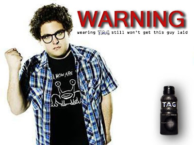
The usual 'Tag' body spray commercial tends to go something like this: 'normal' looking guy waits at bus stop, sprays some tag on himself... bus arrives, a dozen playmates jump him and begin to wrestle in the mud. And then it closes with the message consider yourself warned

Kickstart Remix

This poster is to show the effects of liver disease from drinking. She is yellow because she is jaundiced.

Kickstart Posters


This is the Remix!

Since I didn't want to culture jam the company I work for, I decided instead to do a remix on wedding industry ads. I'm currently getting married and all the wedding magazines and shows are pushing more and more expensive options to potential brides and grooms out there. The amount of an average American wedding is now approximately $28000 (Bridal Association of America).


The original ad here is for Moores menswear. The point of the ad is all about how good the guy looks in his tux. But maybe it could be about something else instead:

My Kickstart Posters


Kickin' it old school: Poster #2

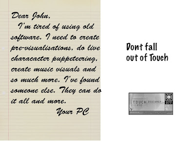
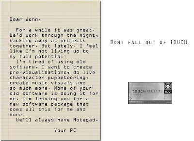
For my second kickstart poster, I decided to tell a bizarre little story with a play on words punchline. I conceived the idea of a computer breaking up with its owner via a "Dear John" letter. The computer would outline all the things that it desired from the "relationship" and how it had found all those things (product features) in TouchDesigner.


In my first mock-up, I used a handwritten font for the letter. The major problem was that the font took up a lot of room to remain legible. The tag line "Don't stay out of touch." is also weakened by being broken up.


I shrank the line paper background slightly and added a drop-shadow to give the ad some three dimensionality. Now the breakup letter looks more like it's sitting on top of the rest of the page.


Since I wanted to give a bit more detail in the breakup letter, I decided to switch to a more "computery" font. I eventually chose an OCR font, since I reasoned the computer would process any handwriting and convert it via OCR. Also, its very legible at a smaller point size than the previous handwritten font.


I switched the font on the tagline. To reduce noise and not introduce too many other typographic elements, I chose to use the same font as the one present in the TouchDesigner logo. The font is a small-caps font so it does reduce the legibilty somewhat due to it's blockiness, but I felt that the shortness of the tag-line combined with the added link to the logo justified the slight loss in readabilty.


Added a bit more detail to the letter. I tried to play up the romantic details a bit more so that it wouldn't be clear immediately that the "author" of the letter was in fact a PC.


A bit of realignment of elements on the right side and I eliminated all contractions from the letter. If Data can't do contractions, then there's no way your PC can.

DOVE - REMIXED -


I chose to remix DOVE's "Campaign for Real Beauty" because of the unethical chemical's used their shampoo that is harmful to young girls. By making products with inferior ingredients, they are polluting the water system, as well as depositing harmful toxins into their customers bloodstreams by chemical absorption through the scalp. Shame on Dove.

Here's an ingredient list for your viewing pleasure.

alkylphenol ethoxylates (APEO) : hormone disruptors, carcinogenic

methylisothiazoline (MIT) : neurological damage

parabens (alkyl parahydroxil) : an oestrogen mimic, traces found in breast milk, decreased male fertility

phthalates : reproductive and developmental defects, allergies, asthma

propylene glycol (propan 1.2 diol, PG) : dermatitis, skin problems, depression, nerve and heart disorders

sodium lauryl sulfate (SLS) : skin, eye, respiratory, liver, lung, immune system damage, hair loss, and reproductive problems. This is not to be confused with the mild detergent found in many shampoos : sodium laureth sulfate (SLES), which some believe to be acceptable in shampoos.

formaldehyde

CULTURE Jamming - DOVE "Campaign for Real Beauty"


Company: Unileaver's "DOVE"
Slogan: "The Campaign for Real Beauty"

Synopsis: Dove's "Campaign for Real Beauty" promotes self empowerment for young girls (14 years old in this poster) by teaching them to have confidence, and conducting education workshops with a self-esteem mandate. The campaign's literature describes that for each Dove product purchased, proceeds are directed towards the Dove "self-esteem" fund.

Design Elements: The ad is very clean, with crisp images of young girls smiling, which speaks to the ad's observer, by bringing life and action to the flat page. Also, repetition is used to re-enforce the adolescent audience, with a small discrete Dove slogan in the bottom right corner. The campaign's mission is also on the ad, in a smaller less visible font at the bottom of the page.

Monday, November 10, 2008

Let's Start Kicking: Poster #1 progress

A quick walkthrough of my first poster design.

The concept is a play on the old "Reach out and touch someone" ads.


My first version of the poster used the text directly from the old ad above. I was trying to do a comparison between the old ad and the company I work for's product TouchDesigner. My thought was to juxtapose the phone as the point of the old ad vs. the software of the new. The years were added to make emphasize the differentiation. I hadn't decided on what text to use, so the content was mostly a cut-and-paste from our company website.


After this, I got some feedback from Prof. O'Gorman and I agreed with him that the phone confused the poster somewhat. I decided to stick with the basis of the slogan but veer off differently. I dropped the comparison and went to a focus on the target market for the product.


Next version dropped the text block and added some screen captures from the software.


After that, it was a matter of just arranging the elements on the poster in the best possible way.

Ketchup 2: This Play Text has No Logo


Display text exercise from class using Klein's No Logo.

The display text is Rosewood Std at 72 pt.

Catchup 1: Not So Sharpie


My Sharpie kickstart ad from a few weeks ago.

Sunday, November 9, 2008

Energy Conservation Ad

This is a fantastic ad that made me laugh out loud that uses practicality as it's marketing technique.

Thursday, November 6, 2008

Altoid Ad

Altoid Ad

Altoids


This ad uses repetition and without words.

Real Miller Chill Ad


This is a real Miller Chill ad as opposed to my Kickstart one..........mine's better

Thursday, October 30, 2008

Wednesday, October 29, 2008

Microsoft Ad


Now this is a productive way of advertising.....FOREVER MUHAHAHAHAHA

Monday, October 27, 2008

apple ad


found this ad from apple...i thought it was a good use of repition and accumulation

Thursday, October 23, 2008

rough drafts


RUND.ca v1.0


The original layout of the RUND.ca website.

WallPaper


Wednesday, October 22, 2008