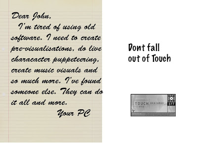
In my first mock-up, I used a handwritten font for the letter. The major problem was that the font took up a lot of room to remain legible. The tag line "Don't stay out of touch." is also weakened by being broken up.

I shrank the line paper background slightly and added a drop-shadow to give the ad some three dimensionality. Now the breakup letter looks more like it's sitting on top of the rest of the page.

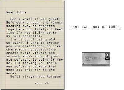
Since I wanted to give a bit more detail in the breakup letter, I decided to switch to a more "computery" font. I eventually chose an OCR font, since I reasoned the computer would process any handwriting and convert it via OCR. Also, its very legible at a smaller point size than the previous handwritten font.

I switched the font on the tagline. To reduce noise and not introduce too many other typographic elements, I chose to use the same font as the one present in the TouchDesigner logo. The font is a small-caps font so it does reduce the legibilty somewhat due to it's blockiness, but I felt that the shortness of the tag-line combined with the added link to the logo justified the slight loss in readabilty.

Added a bit more detail to the letter. I tried to play up the romantic details a bit more so that it wouldn't be clear immediately that the "author" of the letter was in fact a PC.

A bit of realignment of elements on the right side and I eliminated all contractions from the letter. If Data can't do contractions, then there's no way your PC can.
No comments:
Post a Comment